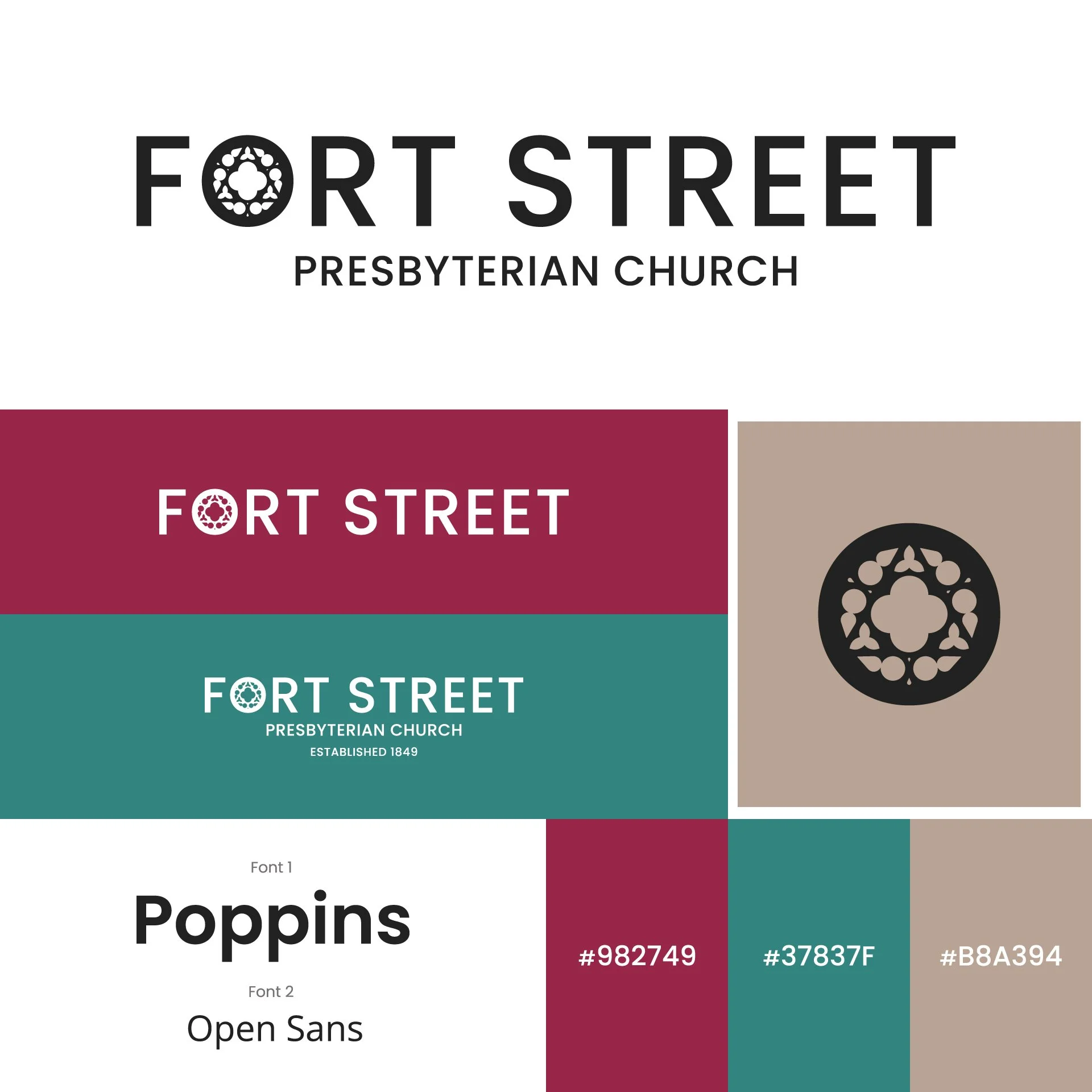
Reimagining the Brand of Fort Street Presbyterian Church
In the heart of Detroit stands a church with deep roots and a living mission. Fort Street Presbyterian Church has long been known as a place where faith meets justice, where music fills the sanctuary, and where community is not just welcomed but celebrated.
But like many historic institutions, its visual identity had not kept pace with its evolving mission.
When the opportunity arose to redesign the church’s brand and website, the goal was not simply to modernize a logo. It was to capture the spirit of a congregation that is both historic and forward looking.
The result was a brand anchored in a single powerful symbol already at the heart of the church.
Finding the Symbol Already There
Instead of inventing a symbol from scratch, the design process began by looking inward.
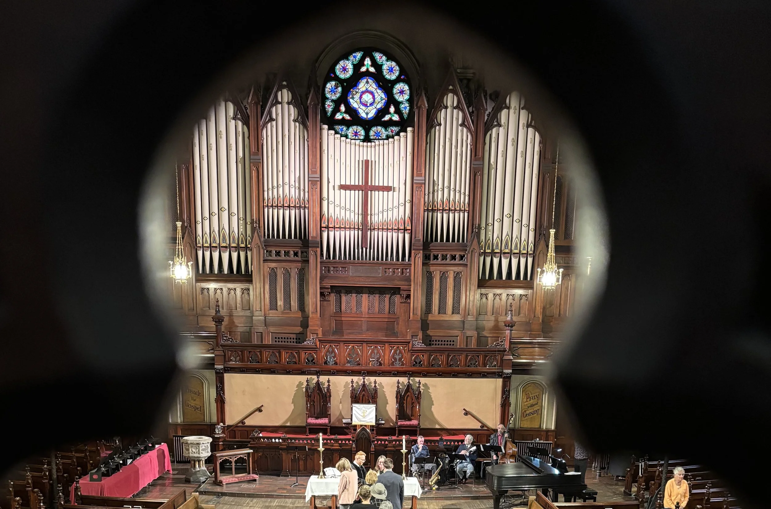
Inside the sanctuary sits a beautiful circular stained glass window positioned prominently at the front of the church.
Noticing that window became the breakthrough moment.
Rather than depicting the entire building or architectural elements, the design distilled this circular window into a simple graphic form and embedded it directly into the wordmark.
The O in “Fort” became the stained glass window.
This allowed the logo to remain clean and modern while still being deeply connected to the physical space of the church.
It is subtle, meaningful, and immediately recognizable to members who gather beneath that window every week.
A Rainbow Gradient with Purpose
Fort Street Presbyterian Church is an openly affirming congregation, welcoming LGBTQ+ members and actively supporting inclusion in the church and community.
To visually reflect that commitment, the stained glass “O” was designed using a rainbow gradient.
The decision was intentional.
Rather than feeling loud or symbolic in an obvious way, the gradient flows naturally through the circular glass motif. It evokes the beauty of light passing through stained glass while quietly communicating the church’s message of belonging.
Balancing History and Simplicity
The broader visual system was built around the pastor’s request for monochrome or muted palettes with intentional simplicity.
The rainbow window remains the focal point, while the surrounding typography and layouts stay restrained and modern.
This design approach accomplishes several goals:
• Keeps the brand flexible across print and digital
• Allows photography of people to remain central
• Maintains visual clarity at small sizes like social media icons
• Honors the historic setting without feeling dated
The result is a brand that feels rooted without feeling stuck in the past.
A Simple Mark with a Deep Story
The finished brand feels deceptively simple.
At first glance, it is a clean modern wordmark with a colorful circle.
But behind that circle is a story rooted in architecture, theology, and community.
It connects the physical sanctuary with the digital world.
It reflects the light of stained glass and the diversity of the people who walk through the doors.
And it embodies the message Fort Street Presbyterian Church shares with the city every week:
Rooted in God's Love. Growing in Justice and Inclusion.
Sometimes the most meaningful brands are not invented at all.
They are simply discovered, already shining through the glass.